Work / Case study
Design System
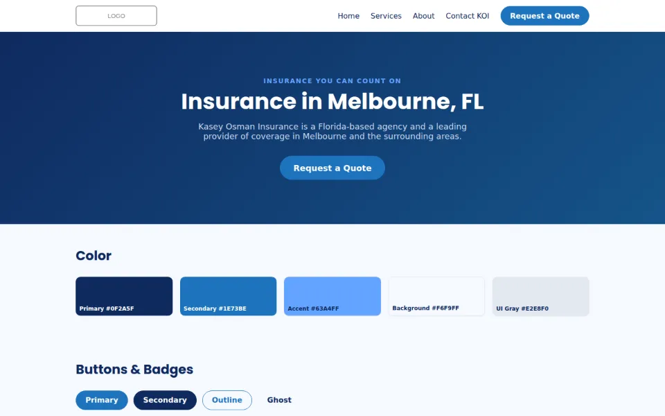
Created a design system (design tokens plus a React component library) to enforce brand consistency and WCAG AA accessibility across web properties.
Source code is private. Walkthroughs are available on request.
10reusable React components
WCAG AAcontrast rules built into tokens
Business impact
Gives every web property one source of truth for brand and accessibility, so pages stay consistent and meet WCAG AA contrast by default.
Problem
Web pages and generated materials drifted from the brand, with no shared source of truth for color, type or components.
Solution
Established one source of truth: CSS design tokens mirrored into a JavaScript theme and Tailwind config, consumed by a reusable React component library and documented in a usage guide.
Results & highlights
- Defined palette, type scale, spacing, radius and elevation tokens with WCAG AA contrast rules
- Delivered 10 reusable components (Badge, Button, Card, Footer, Hero, Input, NavBar, QuoteCTA, ServiceTile, Testimonial), barrel-exported for easy adoption
Competencies demonstrated
- Design systems: Palette, type scale, spacing, radius and elevation defined as design tokens.
- Accessibility (WCAG AA): Contrast rules built into the token set.
- Front-end engineering (React): 10 reusable, barrel-exported components, from Button and Card to NavBar and Hero.
- Tooling integration: Tokens mirrored into a JavaScript theme and a Tailwind CSS config.
- Documentation: Usage guide and a live preview page.
Architecture
- Design tokensCSS variables
- Theme + Tailwind configgenerated from tokens
- React components10, barrel-exported
- Preview pagevisual QA
Notes
- Brand logo URLs were replaced with a placeholder.